 Obviously there are hundreds of Music magazines all diffrent because of the music they focus on. I am looking at several magazines that have different genres of music and different colour schemes. I will be looking at how the front covers present bands, albums news etc.
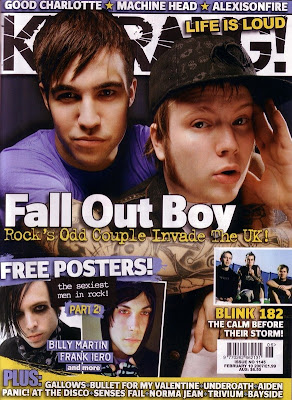
 The popular rock magazine 'Kerrang!' shows a lot of subheadings and a lot of images to show no negative space. The name has been slightly covered up from some images which shows that this magazine is easily recognized and doesn't have to show the full title to get the readers attention.
Along with sub headings it shows a banner at the top which lists names of different bands which could expand it's audience to people who listen to those bands. Popular bands such as Fall Out Boy are enlarged to show its popularity and convince more people to buy it if they like the band and want to know more.
The colour scheme in this one features black, white, blue and gold. The gold colour makes it seem almost valuable as well as it standing out. The black and white tend to go with the title making it more recognisable.
No comments:
Post a Comment